UI/UX Case Study
Project Information
The University of Texas at Austin
TED Website - Information Architecture Analysis
Sep 2022 - Nov 2022
Introduction
What is TED?
- TED is a nonprofit devoted to spreading ideas, usually in the form of short, powerful talks (18 minutes
or less). TED began in 1984 as a conference where Technology, Entertainment and Design converged, and
today
covers almost all topics — from science to business to global issues.
What did we study?
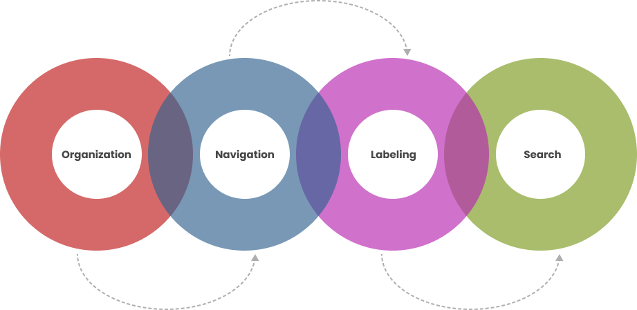
The website is analyzed on the basis of four core principles of Information Architecture.
Organization System
Organization Scheme
An organization scheme defines the shared characteristics of content items and influences the logical grouping of those items. TED website adopted ambigious organization scheme which is defined as below.
Topical Scheme: Content is organized by topics.Alphabetical Scheme: The information is arranged in alphabetical order.
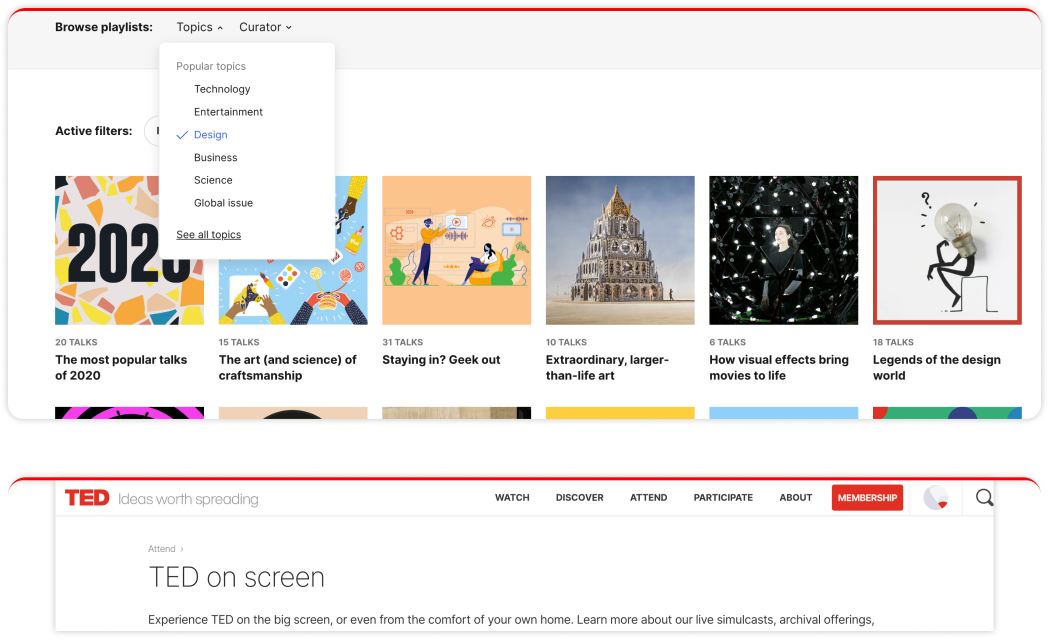
Topical Scheme
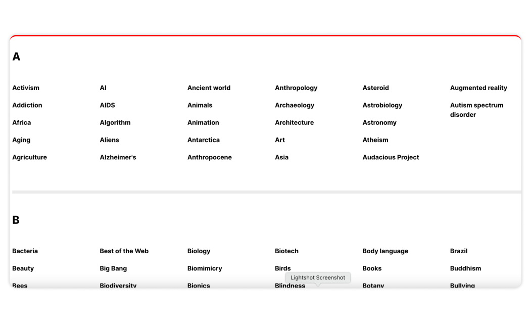
Alphabetical Scheme
Organization Structure
An organization structure defines the types of relationships between content items and groups.
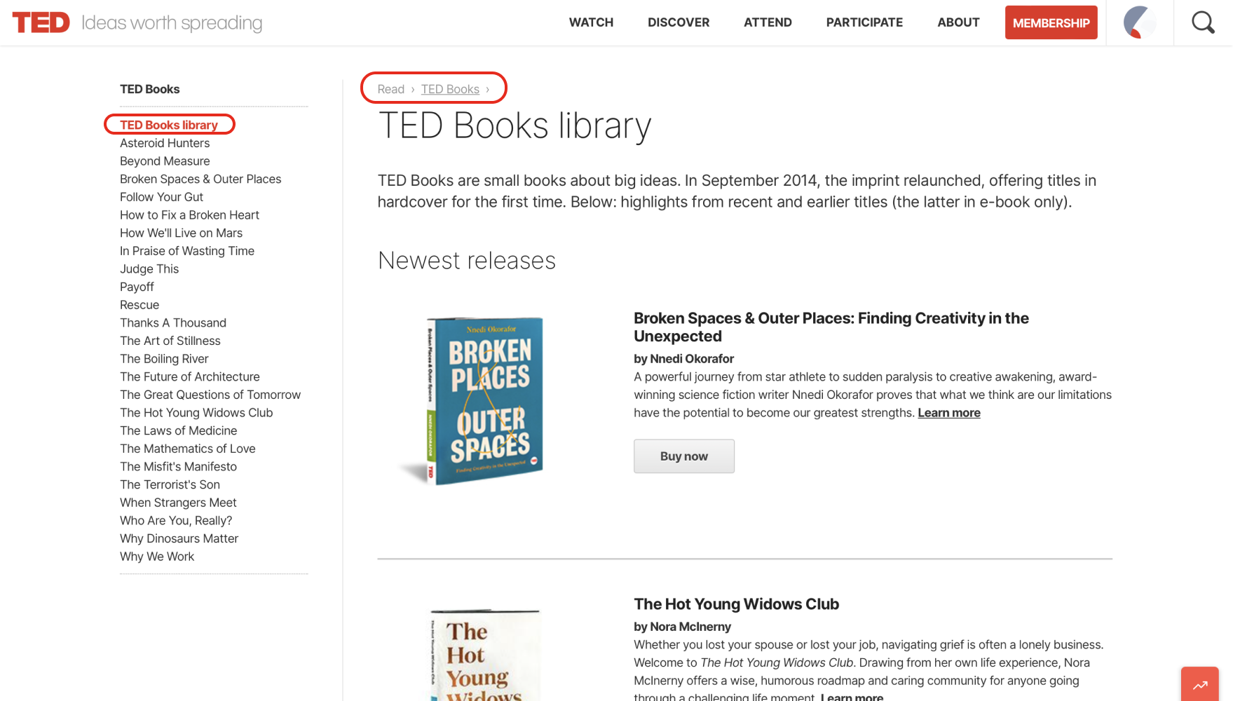
Flat Hierarchy: Ted website shows a list of sub topics as sub menus on each main menu. Rather than burying these under a few broad groupings, each distinct treatment area is surfaced and accessible directly from the drop-down menu in the global navigation. Moderately Deep: Some specific topics are not listed in this menu, so users will have to click through to lower levels of the hierarchy to find them.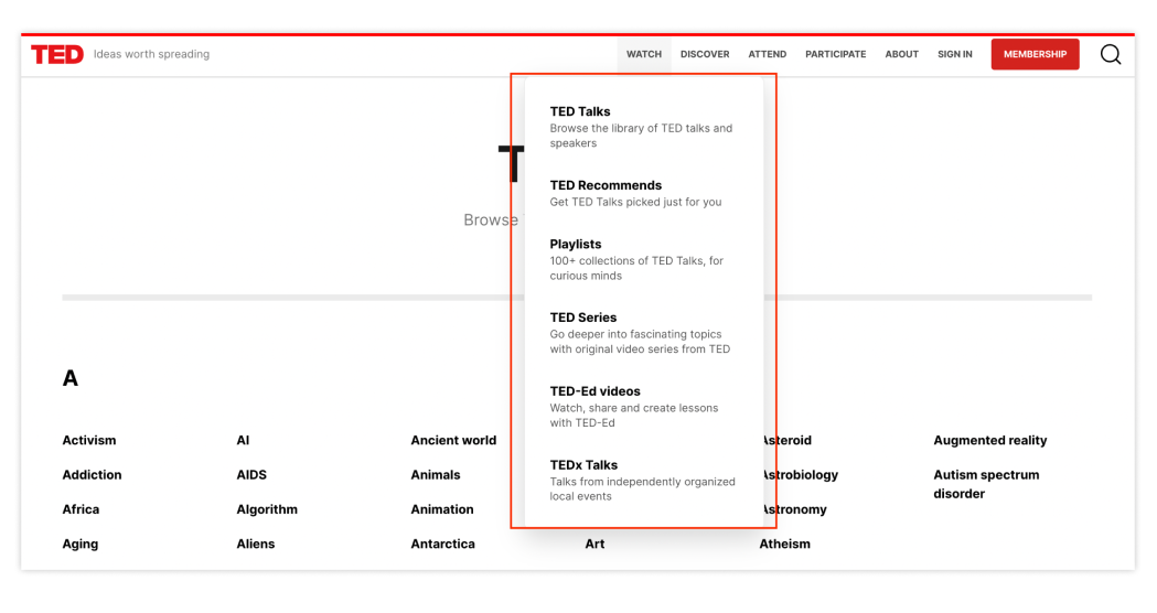
Flat Hierarchy
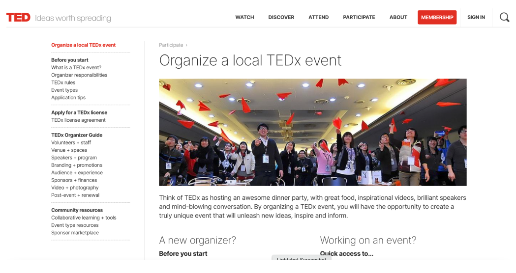
Moderately Deep Hierarchy
Database Model
- Content within this structure leans heavily on the linkages created through the content’s metadata.
- Allow users to find specific information while looking at few pages as possible.
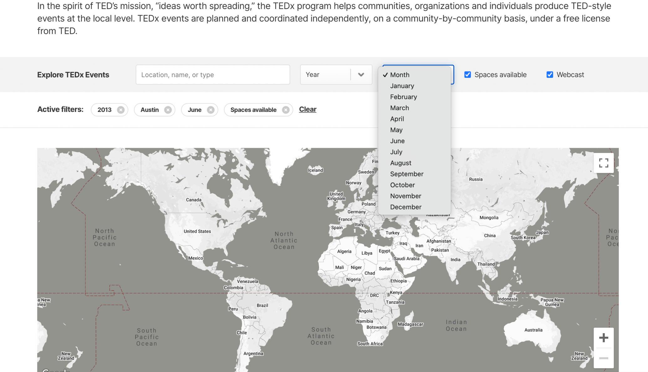
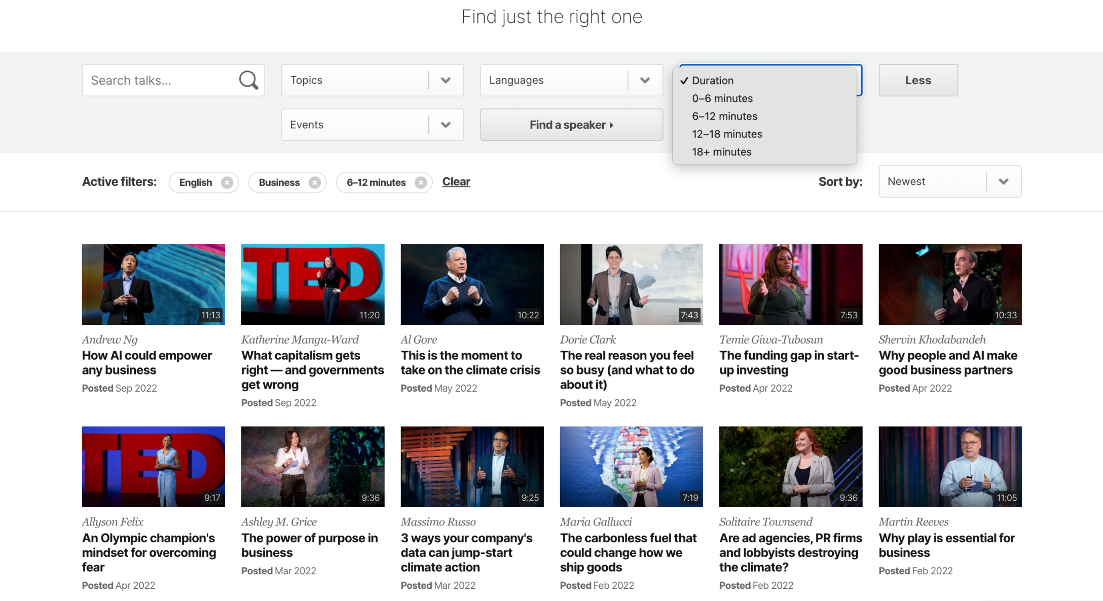
- This model facilitates a more dynamic experience allowing for advanced filtering and search capabilities.
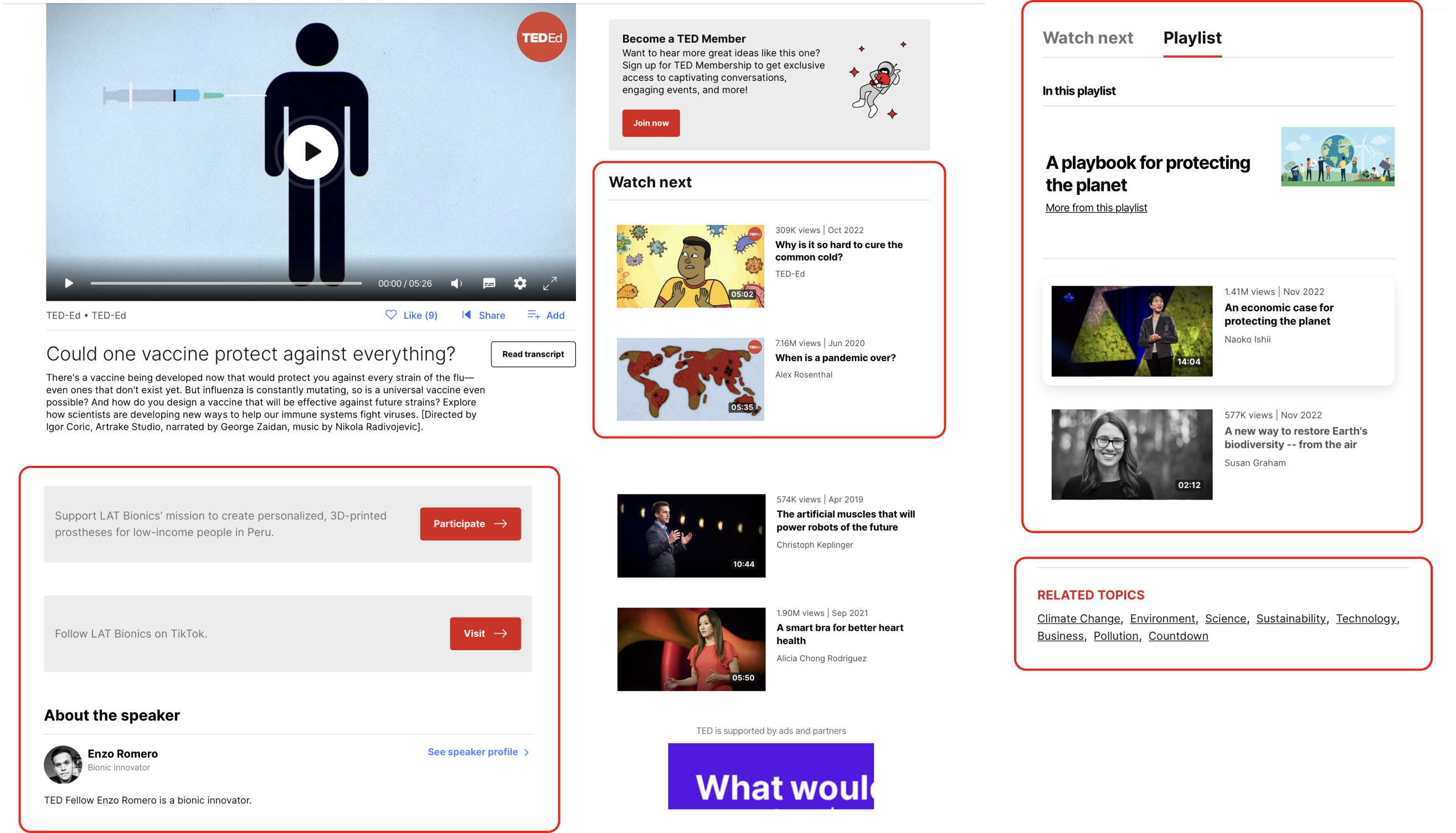
- Provides links to related information in the system that has been properly tagged.
Hypertext Structure
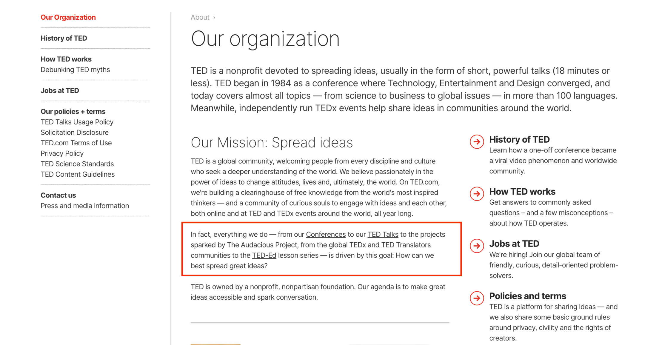
- Hypertext is the concept of interrelating information elements (linking pieces of information) and using these links to access related pieces of information.
- Users can locate content easily and move between content faster.
Labeling
Simple language
- Simple words are employed all over the menu.
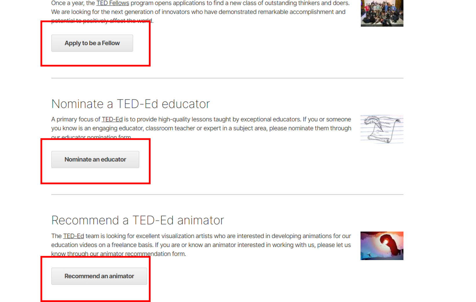
- Button labels employ descriptive terminology.
- Lack of clarity for new visitors.

Representation of Content
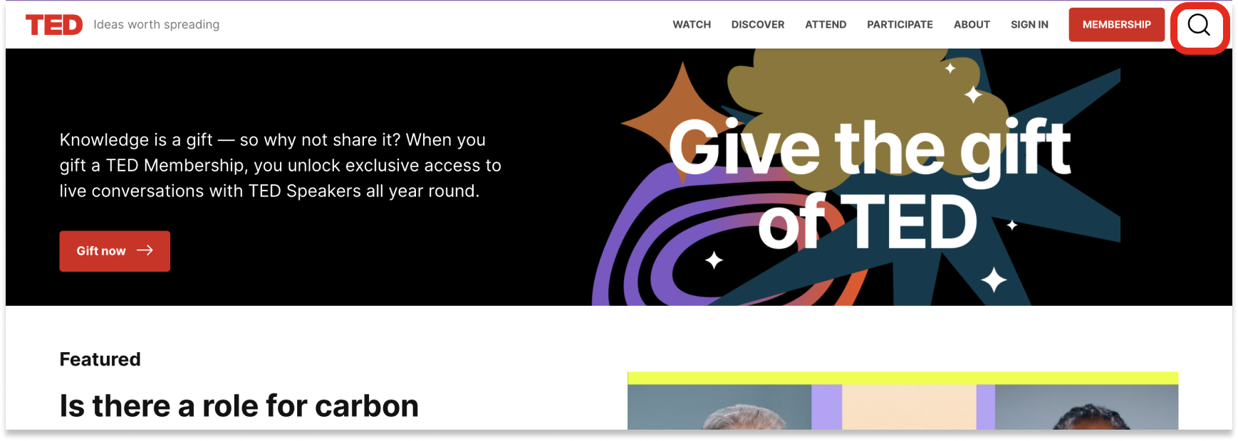
- Labels of TED are just textual, with no iconographic representation. The only icon included on the TED website is search.
- The information for the buttons and menu elements is detailed.
- Some labels are unnecessary and can be replaced by icons.
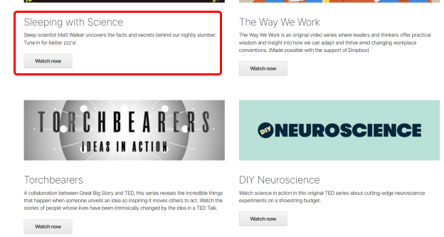
Consistent use of terms
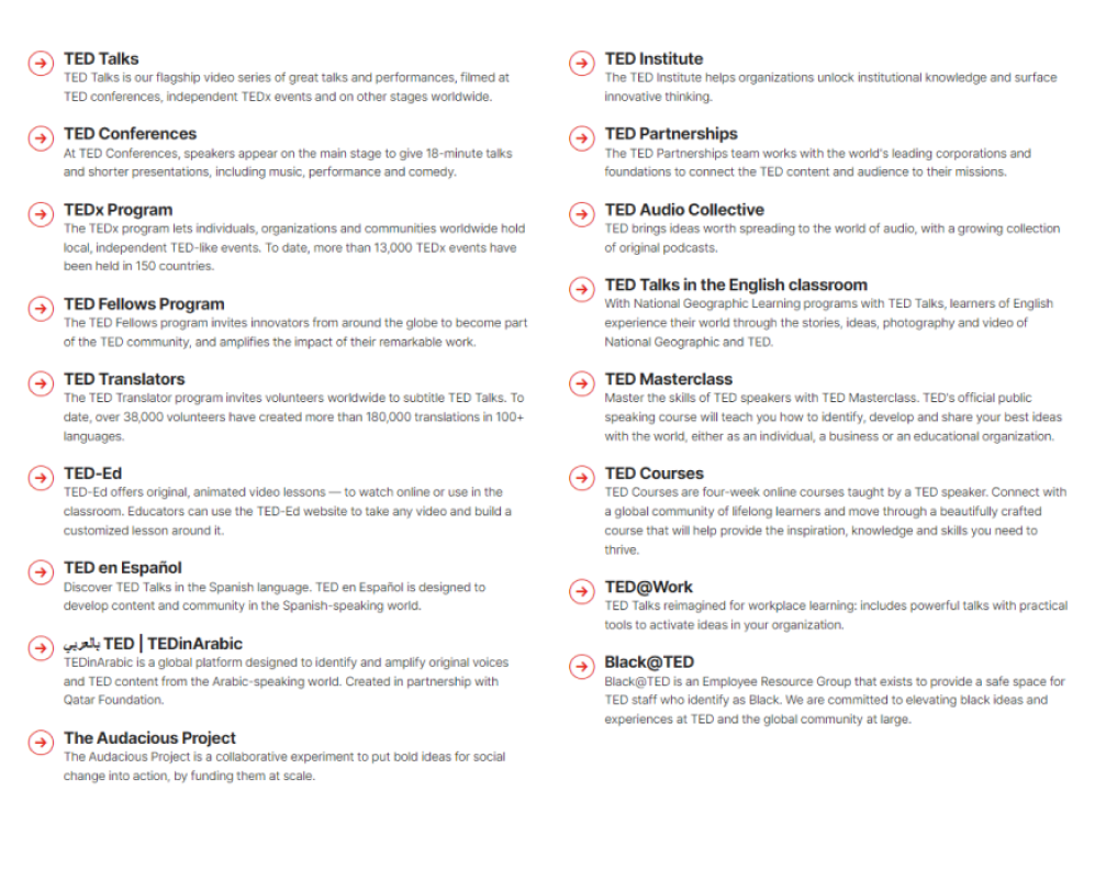
- It sets the tone for the website's constant use of words throughout, expressing every facet of TED as a brand.
- Although non-TED followers may find it annoying to encounter the term “TED” in every part of the website.
- The consistency is sometimes lost.(podcasts -> audiocollective)

Descriptive Title
- All of the page titles act as branding and titles are not descriptive.
- One-line description included to at every reference of the page title.
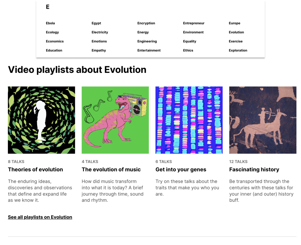
- Index terms can be confusing as same words could have different meanings.
- Eg: Selecting ‘evolution’ with an intent to watch talks about biological evolution would return results about ‘evolution of music’
Context of Page
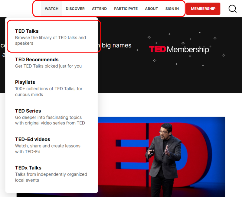
- Menu items are included with a single line description.
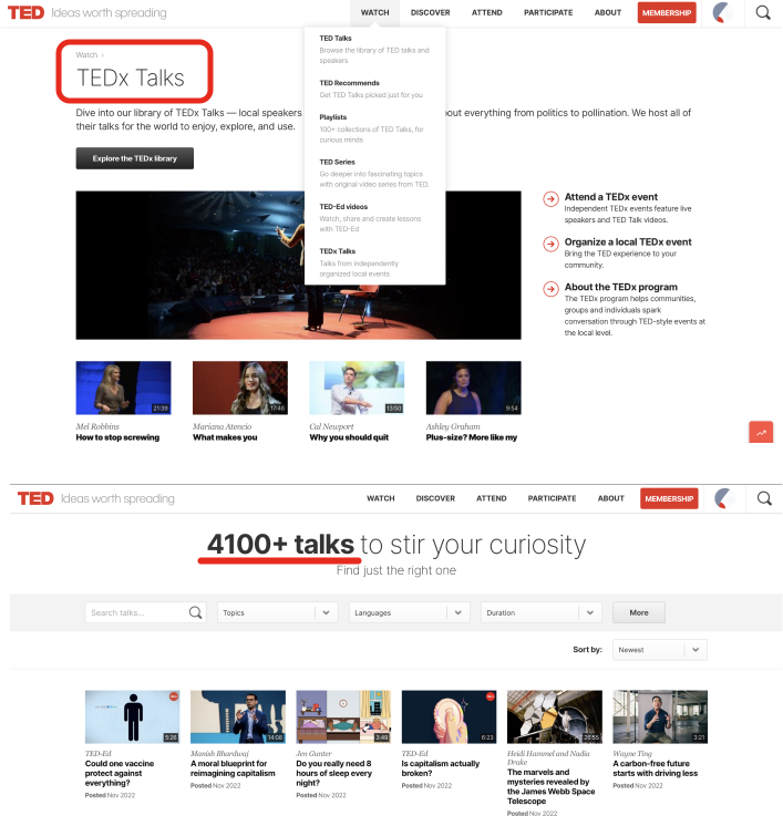
- Simple language that connects menu terms to submenu words, such as watch + playlists/TED Talks, makes sense to read.
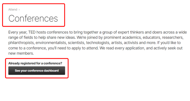
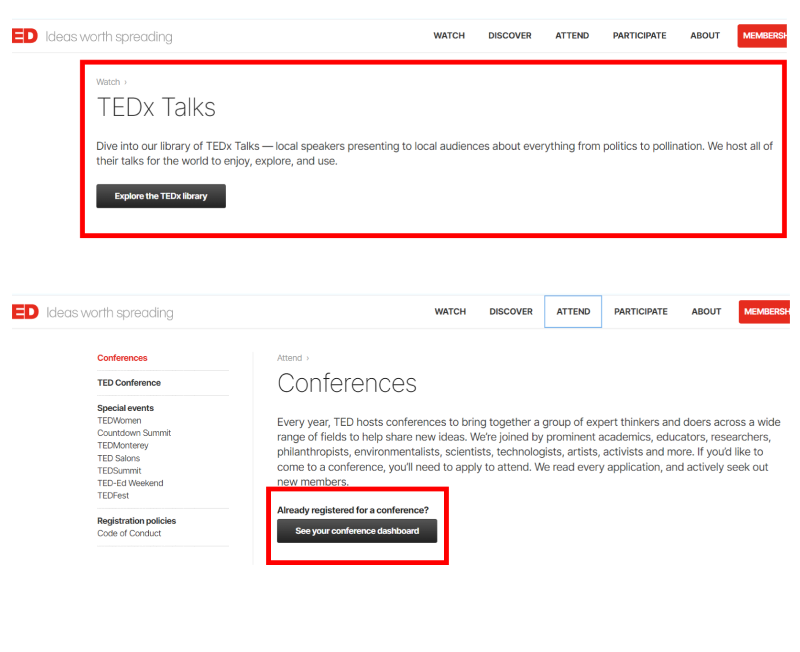
- Every page includes a descriptive header that explains the page's context.
- A descriptive CTA that outlines the action to be taken on the page.

Link Labels
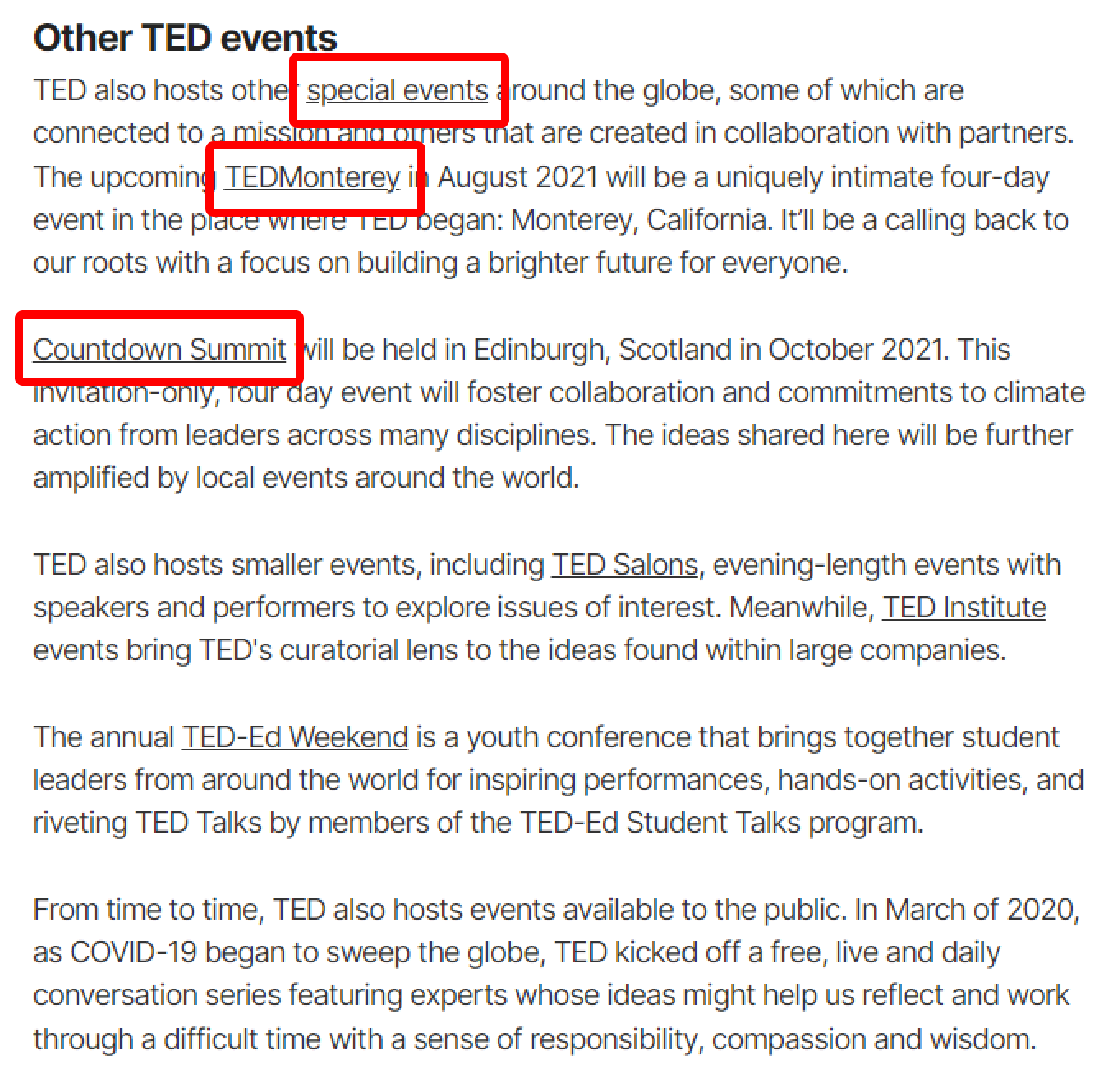
- The usage of link labels across the website assists in simplifying the information for the visitor and reduces ambiguity.
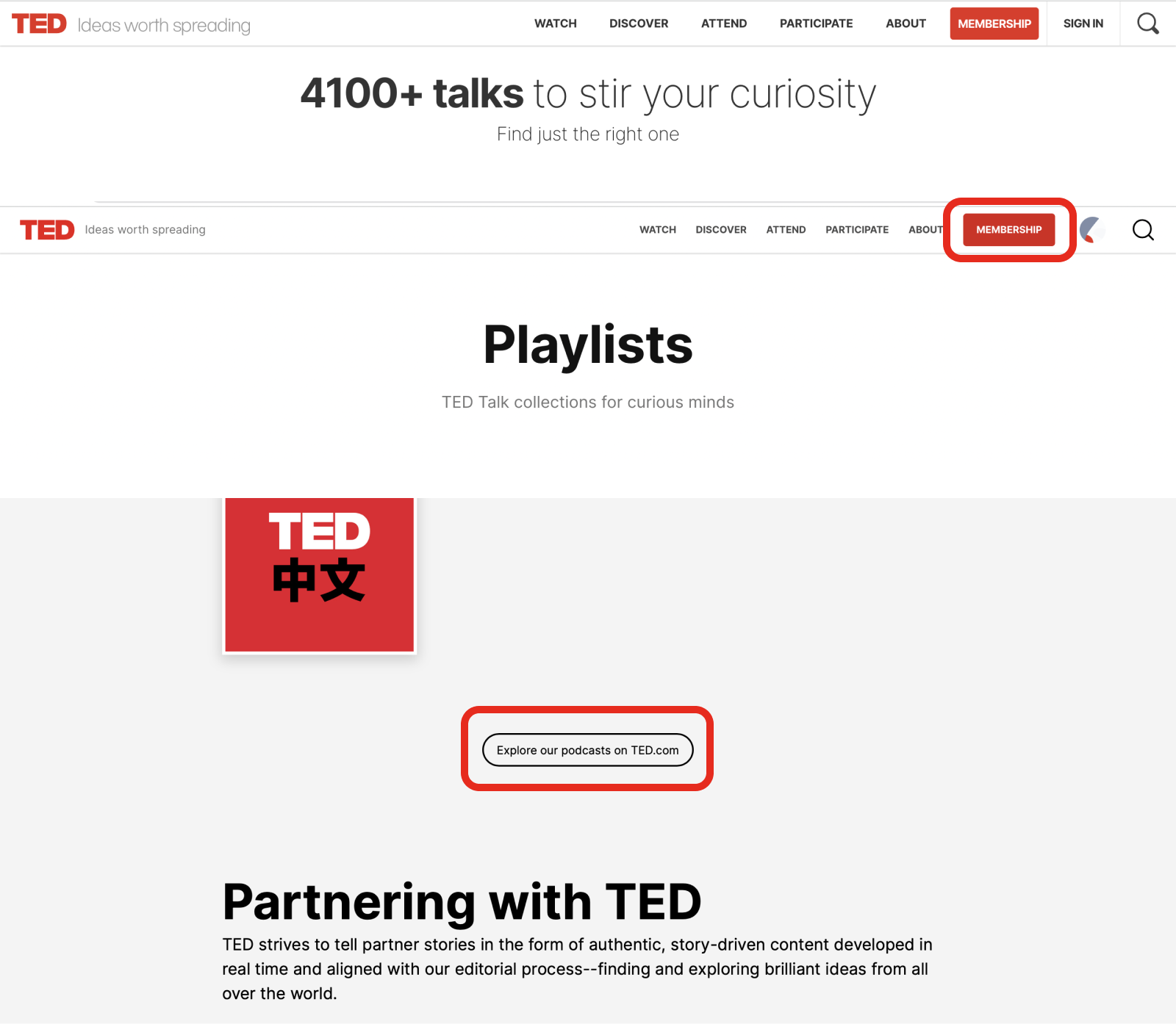
- Link labels should open in a new tab to improve the user experience without causing an interruption to user flow.
Social Tags
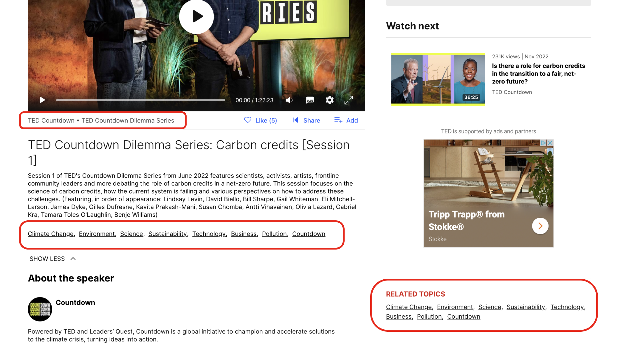
- Categorizing wide range of videos and articles with social tags.
- Inconsistent use of social tags.
- Grouping videos.
Search
General Overview
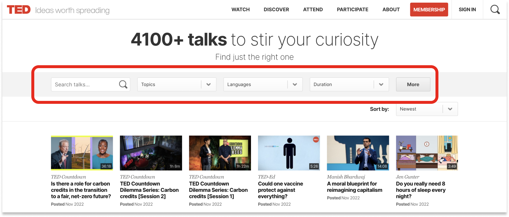
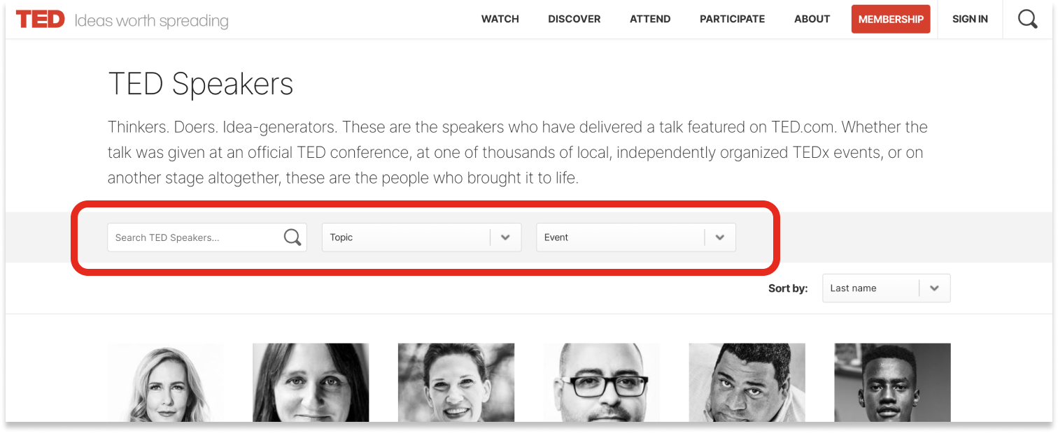
- Three search options are featured on TED.
- The home page features an icon for basic search option.
- The TED Talks page features a search bar for advanced search queries.
- TED Speakers page features indexed search
Query Builders
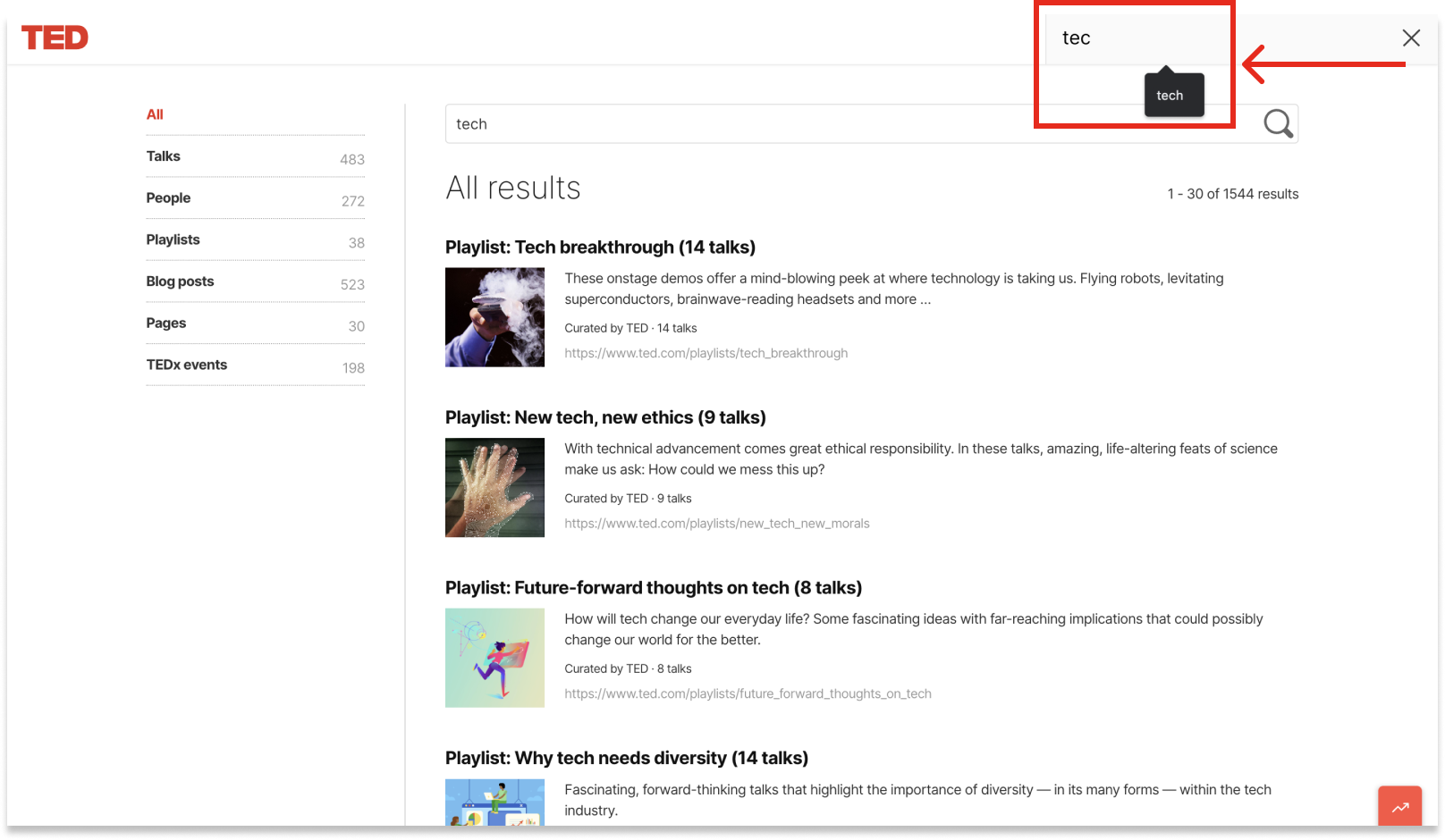
- Auto-completion and auto-suggestion are absent in both search options.
- Global search does not have auto fill, it only features browser suggestions based on past search queries.
Search Zones
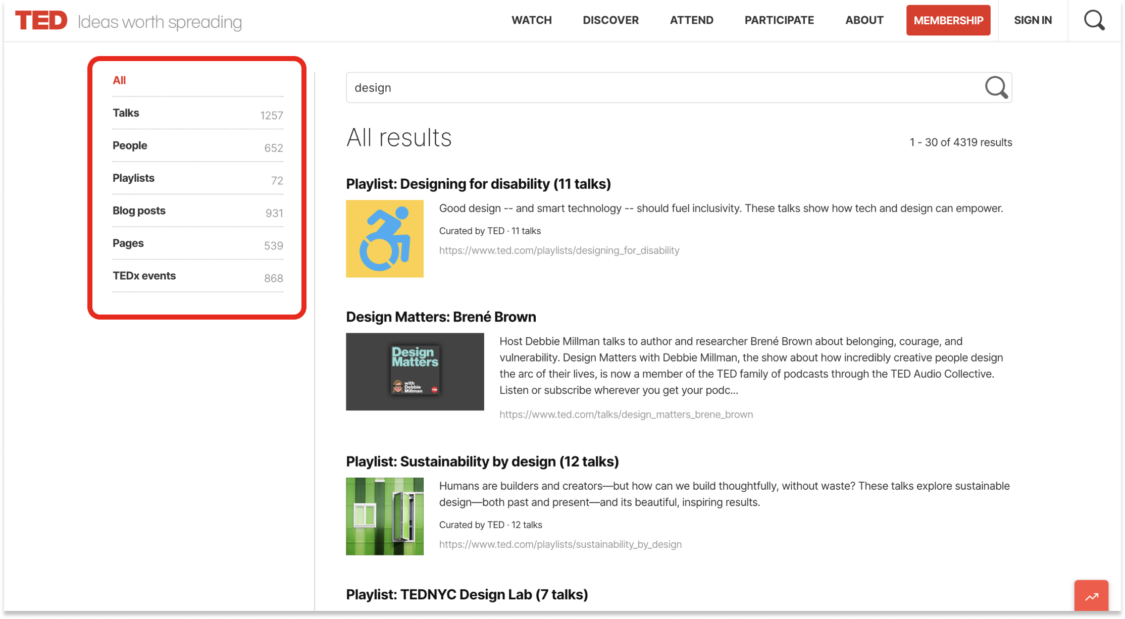
- Search zones are clearly demarcated in search results.
- Allows users to search the keyword in the right zone/context.
- However ‘fielded search’ is present only in TED Talks page and not in general search.
Relevant Results
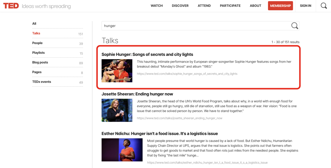
- A search query for the keyword ‘hunger’ features a talk by Sophie Hunger.
- This is despite setting the search zone to ‘Talks’.
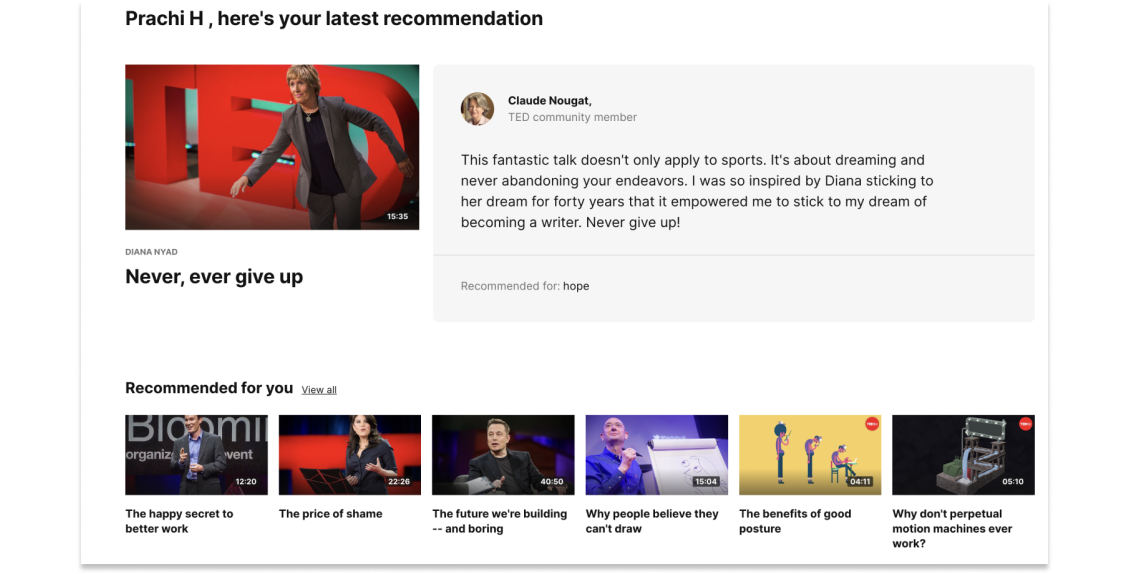
- Despite accepting users’ ‘interests’, the video suggestions are not relevant.
- User selects ‘inspiration’ but recommended video is under ‘hope’ category.


Logical Presentation of Results
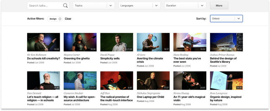
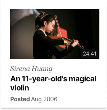
- Search results contain an image with duration, speaker’s name, name of the talk, and date.
- Can include topics or tags
- A short description could help in some cases.
- Search term disappears from search bar, although it appears as a tag below the search bar.
Highlighted Query Terms
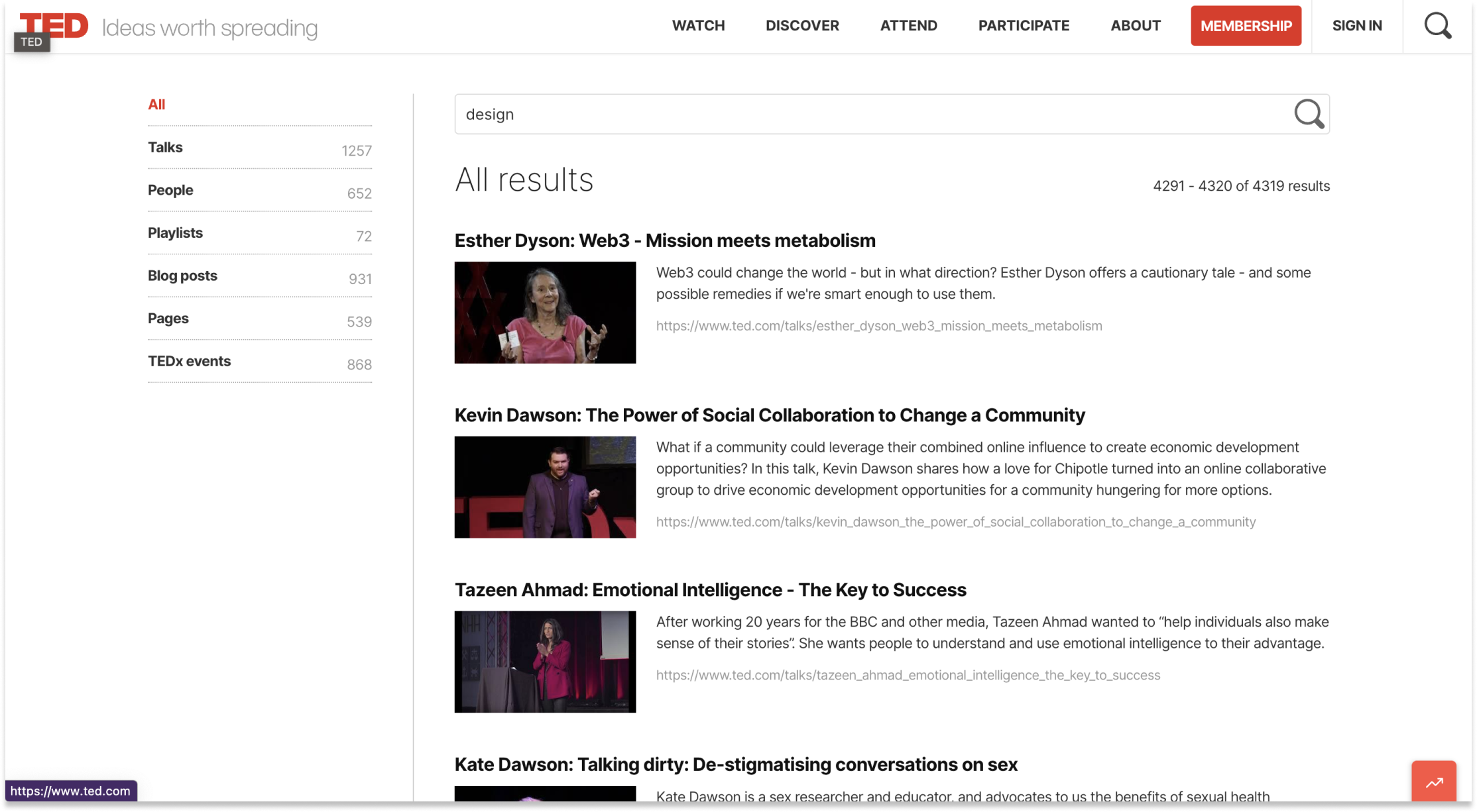
- Query terms are not highlighted in the search results.
- The term ‘design’ is searched but user is unable to evaluate the relavancy of the query term with respect to the displayed results.
Indexes/ Fields/ Advanced Search / Metadata
- Fielded search option, that is available exclusively on the TED Talks page.
- Used to enable fielded search are topics, languages, duration, event name.
- Also links to speaker search
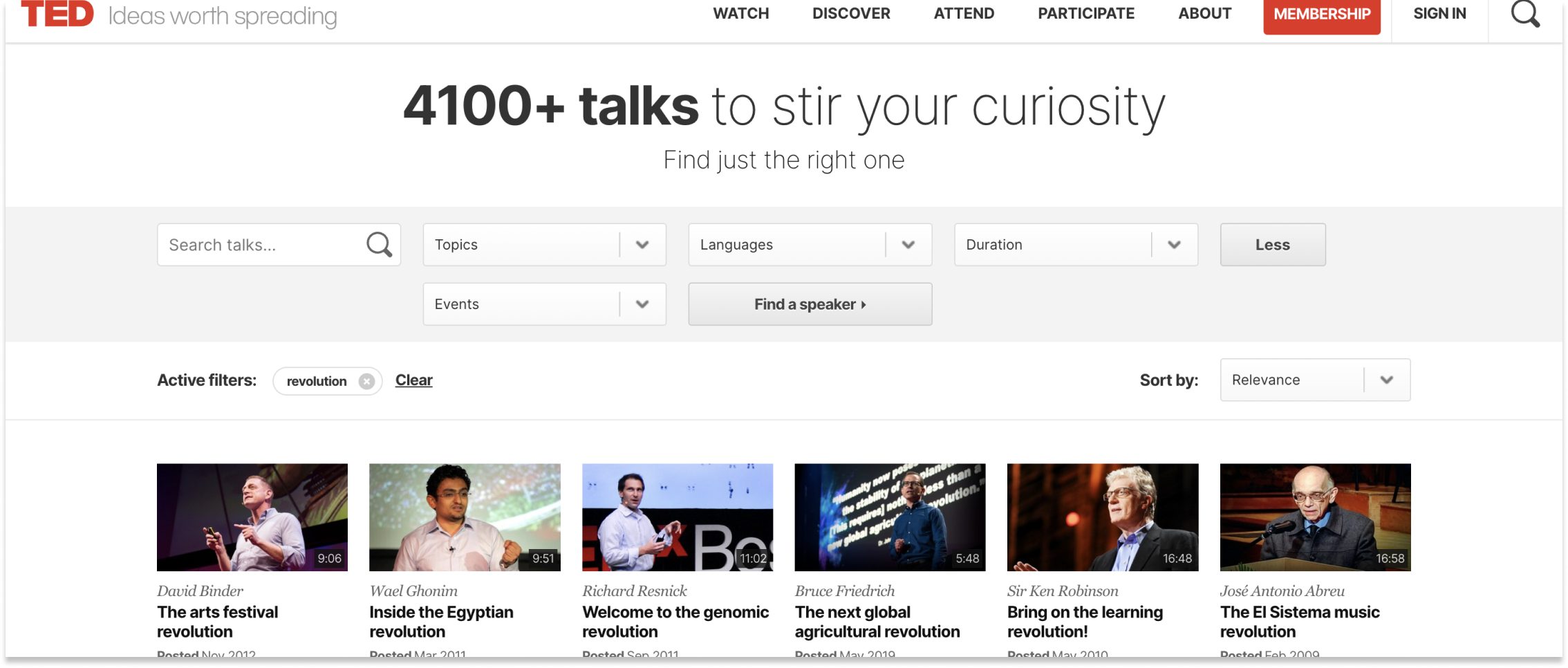
Search Context / Temporal Context
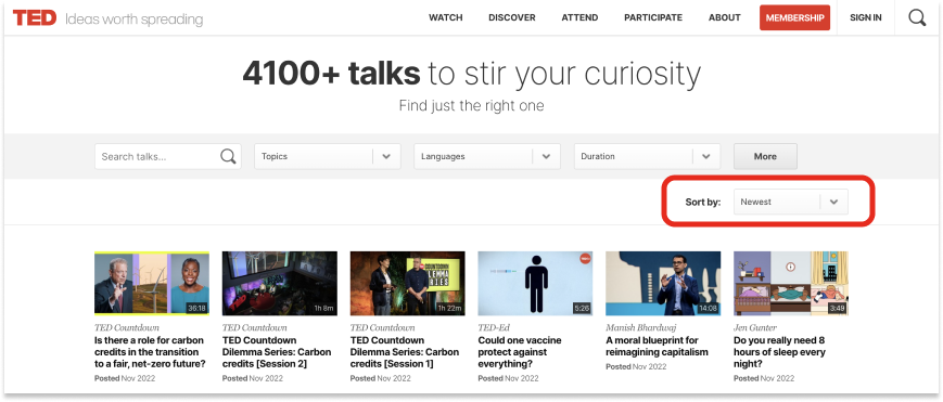
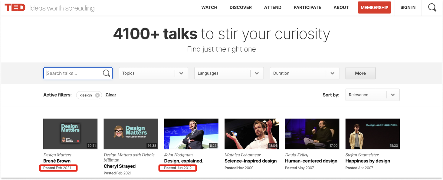
On TED Talks search results have temporal context. No way to filter by year. Can sort by ‘newest’ or ‘oldest’
Pagination
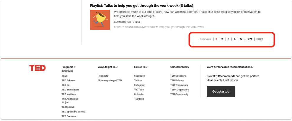
- Pagination breaks a large array of data available on the site into separate pages for ease of use.
- All search results are paginated.
Sorting
TED Talks page feature a sort functionality with the following options:
- Newest
- Oldest (Based on date)
- Relevance (Based on search query)
- Most viewed
