

UI/UX Case Study
Project Information
The University of Texas at Austin
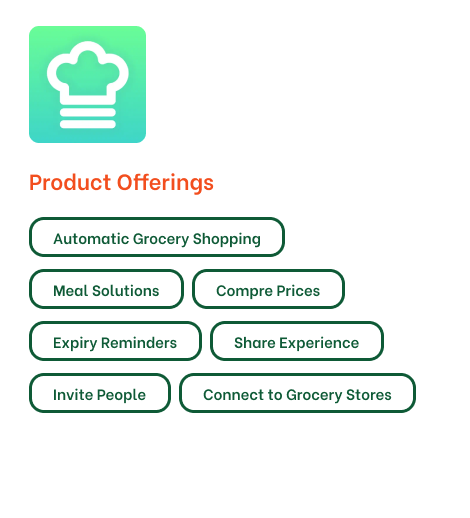
Cook Easy - Mobile Application
Aug 2022 - Dec 2022
Feature by 
Cook Easy App design has been recognized and selected by DesignRush, a prominent name in the world of design and creativity. DesignRush is the leading trends and awards platform that has previously honored renowned brands such as Prada, FIFA, Fenty, Sefa Spices, and many others.
Project Overview
Purpose and Scope
The goal is to design a lifestyle application for smartphone users to assist them with quick/easy home-cook recipes and offers active pantry management. Although we have access to multitudes of recipes and tutorials through various content-sharing platforms such as YouTube, what makes the product unique is that it suggests recipes based on the users’ available inventory, thereby offering them a customized user-centric experience.
Product is expected to fulfil the following purposes
Timeline for project Completion
Gantt chart for Project Timeline
User Research
Target Users
The app is designed for busy students and proactive individuals, without restrictions on age, gender, or household size. Participants who cook and manage their own kitchen were interviewed to identify their challenges with shopping, planning, cooking, and reducing kitchen waste.
Interview Questions
We structured the interview process by creating research questions to inform design decisions and framing questions to answer these research questions. The interviews consisted of 15-20 questions related to the research questions
| User Interview Takeaways | ||
|---|---|---|
| Goals | ||
| To find recipe guidelines/tutorials based on available pantry items. | ||
| To be able to rely on making food rather than take out. | ||
| To save time and money | ||
| To keep track of what food he has at home. | ||
| Painpoints |
|---|
| Limited items in pantry for cooking. |
| Not enough time to cook. |
| Novice in cooking and overbuying items. |
| Adding to pantry in existing apps is a tiresome process. |
| Opportunities |
|---|
| Buying items only that is needed. |
| Having recipe based on available limited items. |
| Quick and easy video tutorials and Removing frustrations. |
| Learning cooking through tutorials and videos. |
User Personas
Alice Watson: Student, lives with roommate
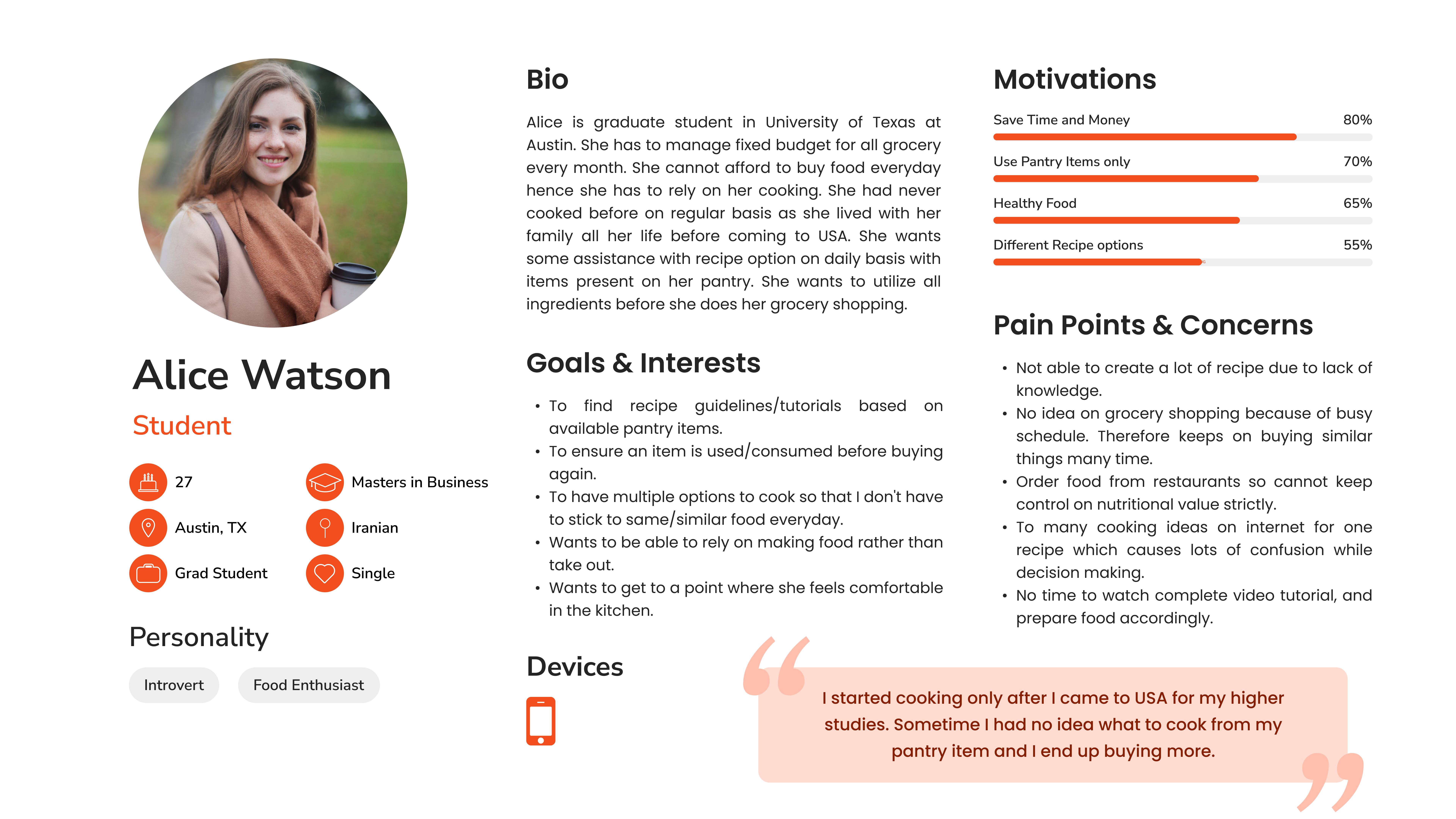
User Persona of Alice Watson
John Joseph: Professional, lives with family
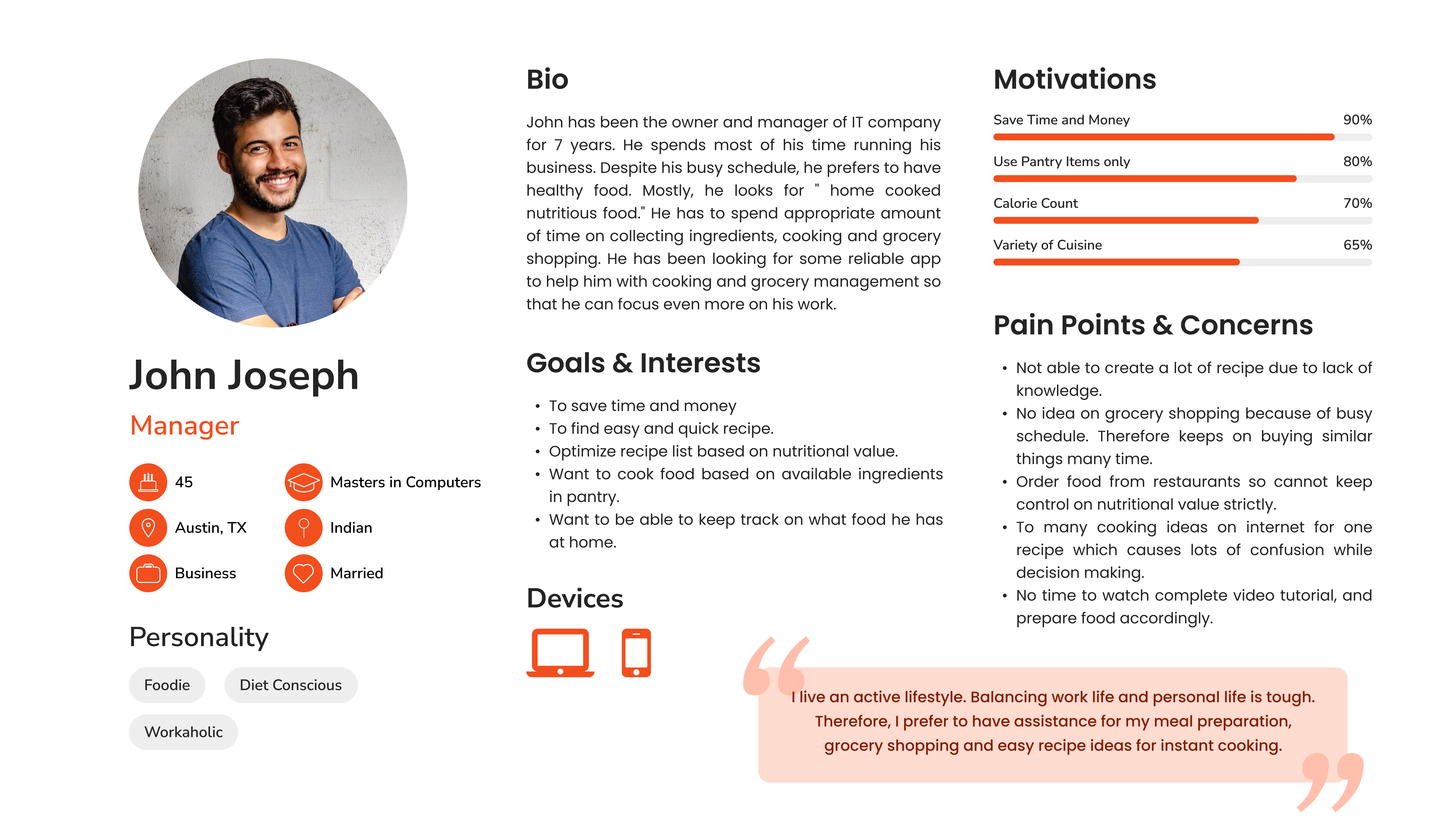
User Persona of John Joseph
Information Research
Competitive Analysis
The overarching goal of this competitive analysis is identifying and evaluating information architecture principles in the context of organization, navigation, labelling and search, employed by the apps that are identified to offer common/similar utilities or serve similar users. The analysis focus on pros and cons of various applications based on IA, App content and Visual Design.
Direct Competitors
KitchenPal
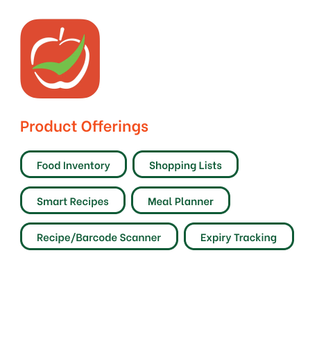
Cooklist
Cozzo
Indirect Competitors
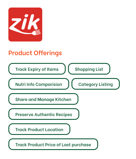
Zik
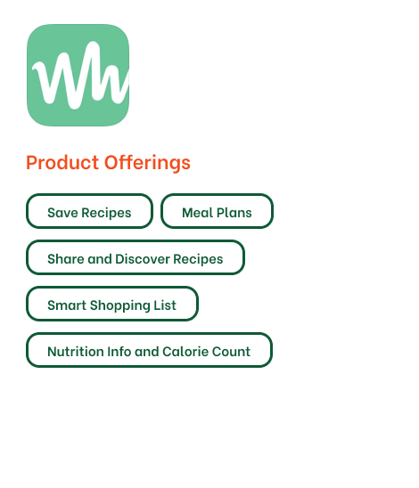
Whisk
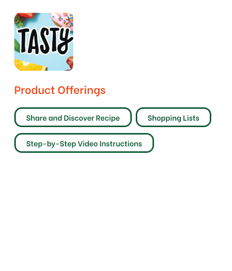
Tasty
Competitive Audit
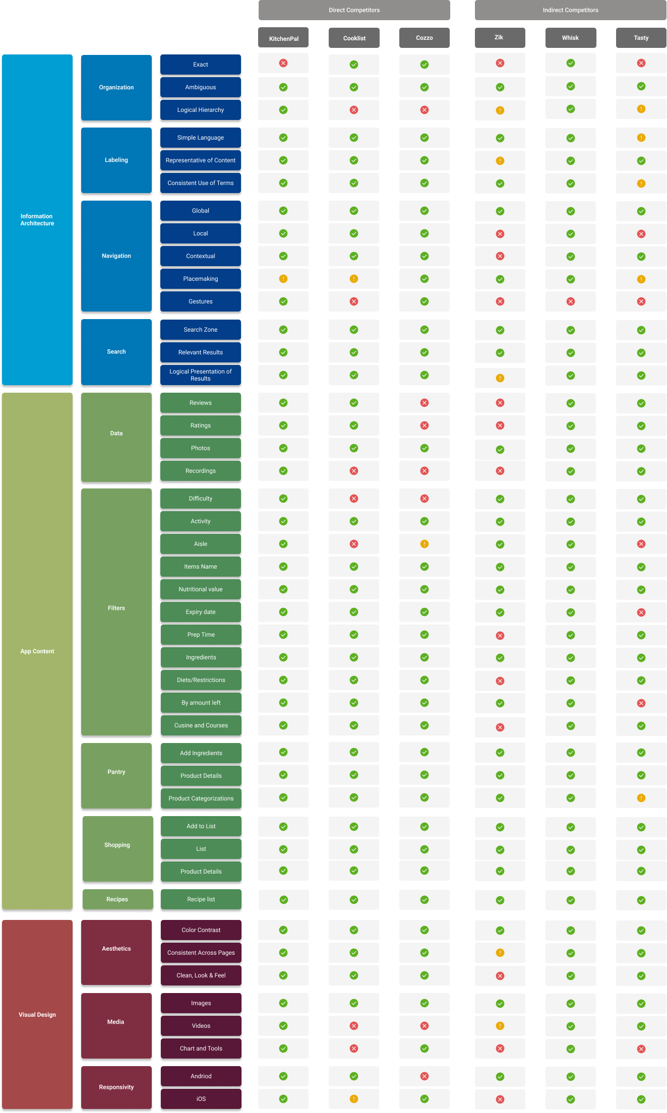
Comparison chart between the apps based on IA, App content and Visual design
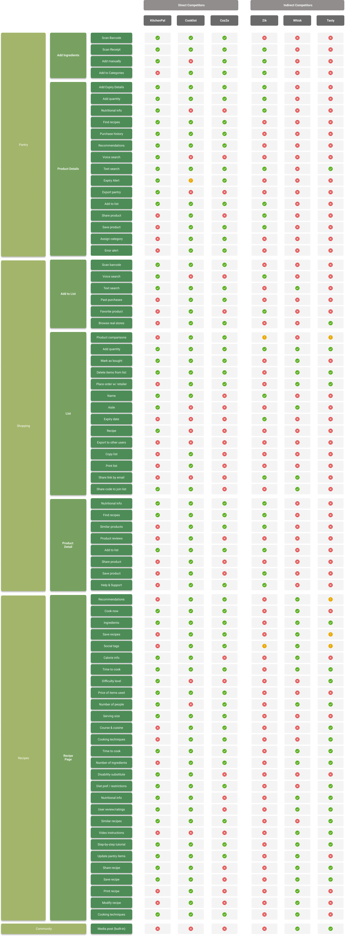
A high-fidelity list of contents to showcase how information has been organized, structured and labelled in different apps.
Concept Model
A diagrammatic representation of the interactions and flows in the kitchen ecosystem, the concept model chart shows interrelations between various content types and processes.
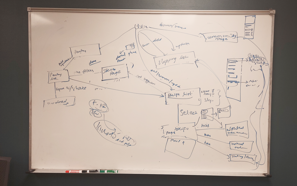
Picture: Concept model development on whiteboard
Picture: Final concept model
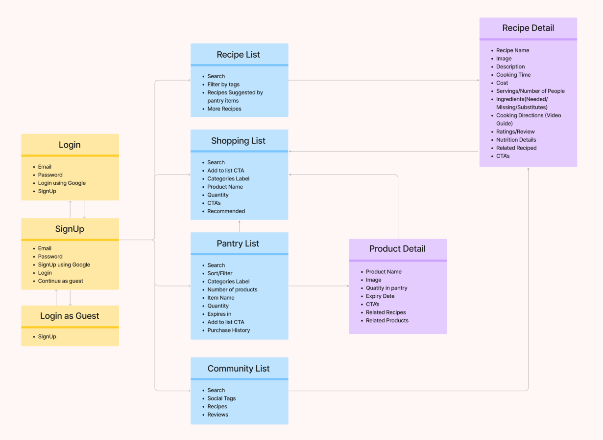
Content Inventory
The Content Inventory consists of all information, Meta elements and categorized list of contents in the application
Information Objects and Controlled Vocabulary
Competitive analysis and content inventory helped us understand the information objects, metadata and controlled vocabulary in our ecosystem. We found that a uniform vocabulary was needed to link pantry objects to recipes, such as linking "Vitamin D Whole Milk- 1 gal- Good & Gather" with "1 cup milk". This is to ensure smooth user tasks and is shown in the figure below.
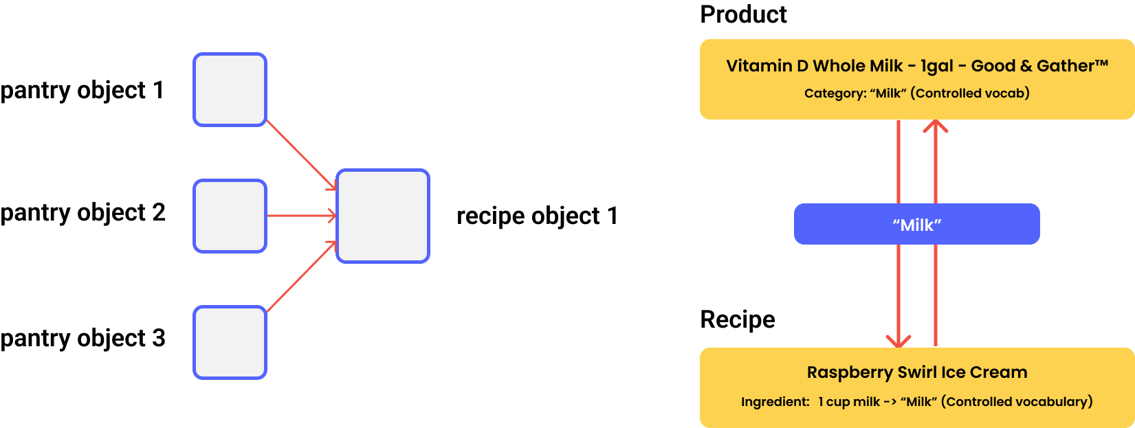
Picture: Information Objects and Controlled Vocabulary
Information Objects and Controlled Vocabulary
We improved the information hierarchy of the app contents to better understand the ecosystem, complementing the concept model. The hierarchy shows the depth and width of the information structure and where each function appears. It is displayed in the figure below.
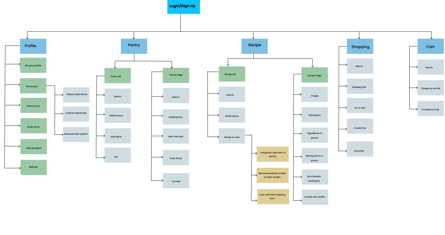
Picture: Information Architecture
The artifacts we prepared through our rigorous user and information research improved our understanding of the app ecosystem and served as the guideline for our design as we entered the ideation phase.
Ideation
User Journey
We divided the user flow into 6 phases to understand user tasks and activities, to ensure a smooth transition. From user journey mapping, we identified opportunities for improvement.
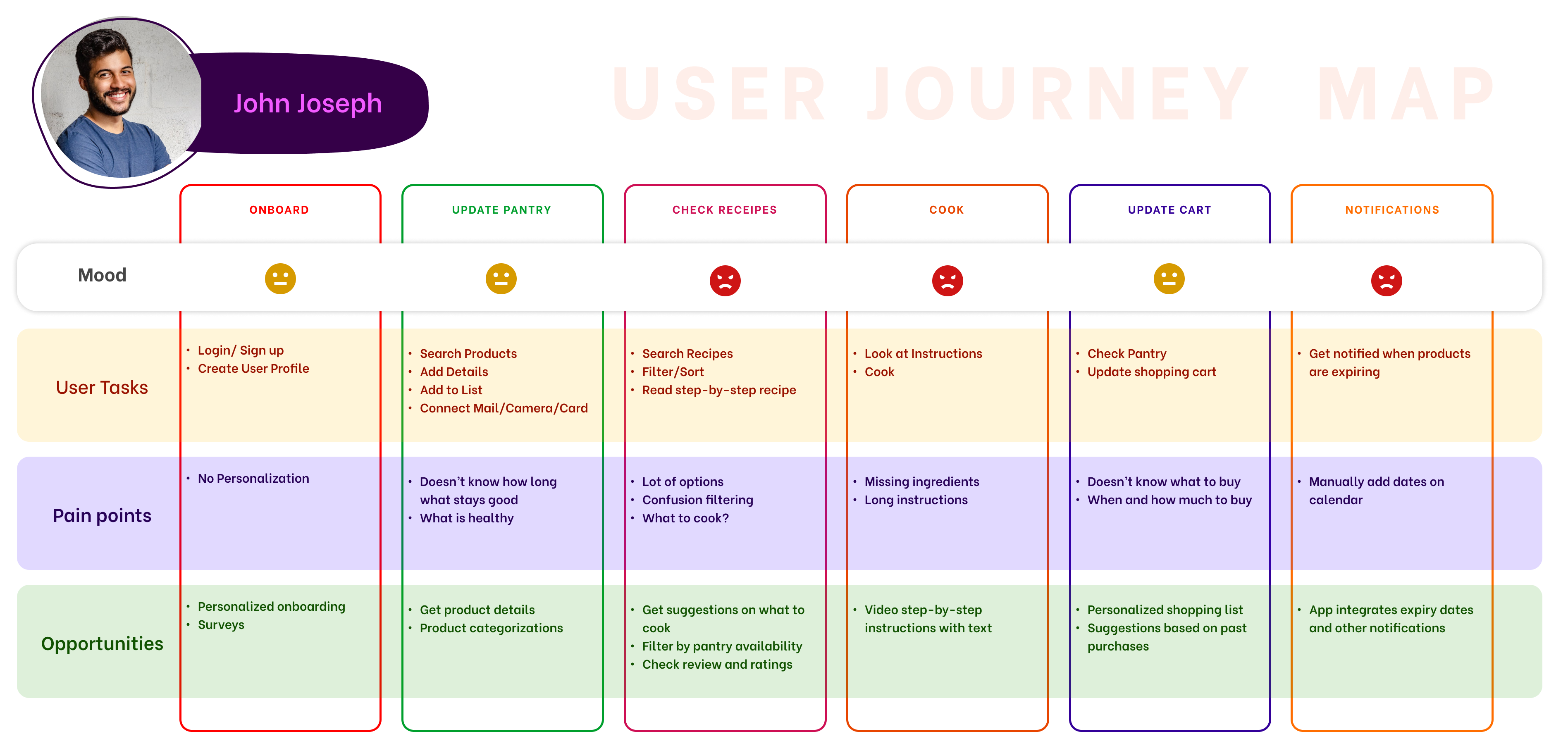
| Key pain points of John Joseph |
|---|
| Manually entering the pantry's contents into a database. |
| Recipes are not being filtered based on user preferences and pantry inventory. |
| Keeping track of the pantry's missing ingredients while studying or testing a recipe. |
| Manually changing the utilization of the pantry and adding expiration dates. |
| Cooking tutorial videos that are unwieldy, confusing, and disorganized. |
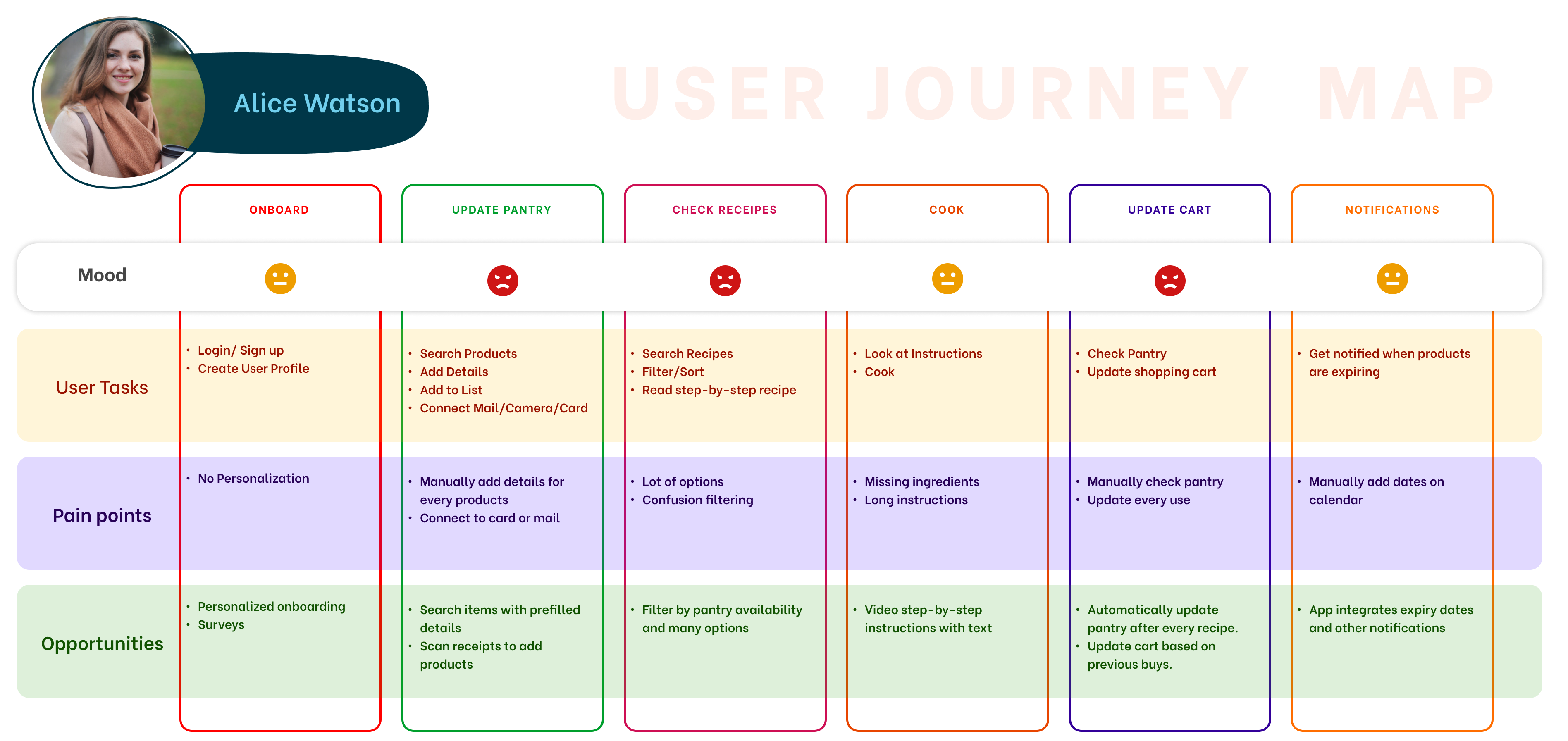
| Key pain points of Alice Watson |
|---|
| Uncertainty over the shelf life of certain foods. |
| Not knowing how to prepare healthy alternatives, although she prefers it. |
| Constantly have trouble deciding what to make right away. |
| Manually changing the utilization of the pantry and adding expiration dates. |
| Constantly overspending and lacking awareness on what to buy. |
Affinity Mapping
We turned user interview data into cards and grouped them into trends. Our goal was to create an app that integrates grocery ordering, recipe recommendation, and pantry management. The major categories were pantry, shopping, cooking, and learning. We wanted to understand how users improve cooking skills. We restructured the affinity diagram for effective brainstorming and made progress in the design phase.
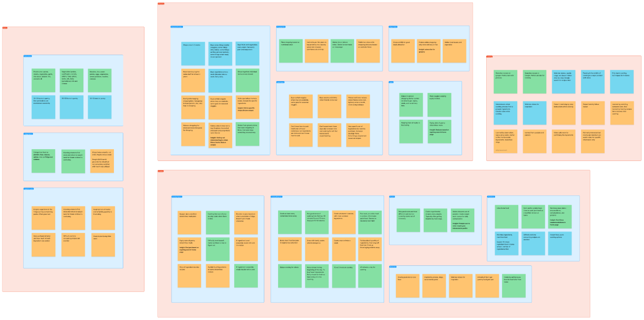
Picture: Affinity Diagram
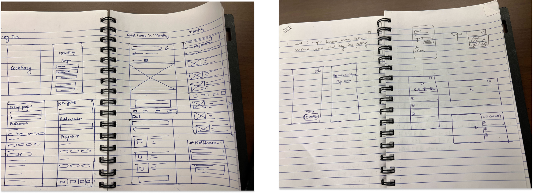
Sketching
We consolidated artifacts and condensed information for the design phase. We started with brainstorming to explore ideas and solutions. Our team focused on creating a seamless flow for effective user communication. We resolved issues for a great user experience based on user suggestions and insights from existing applications.
Picture: Affinity Diagram
Design and Prototyping
In the design phase, we turned sketches into wireframes and prototypes. We started with a low-fidelity prototype, tested it, and modified the design based on feedback. We built a mid-fidelity prototype, then a high-fidelity prototype after user testing confirmed that key tasks could be completed on the mid-fidelity version.
Wireframes
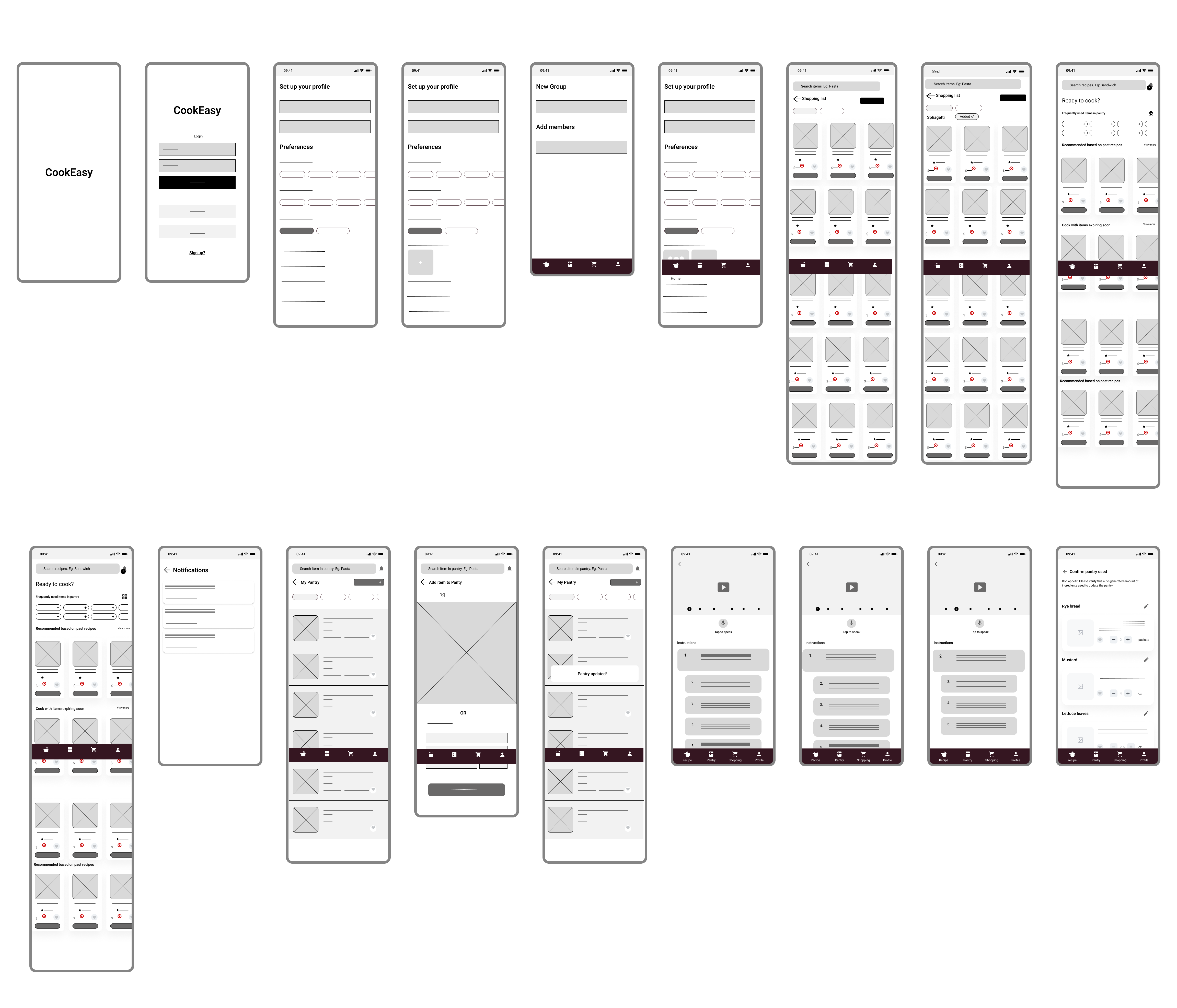
Picture: Wireframes
Low Fidelity
After digital wireframing, we did low-fidelity prototyping, which took the most time. We added interaction to the wireframes and iterated it to perfect the flow and align with users' mental model. After completing the low-fidelity prototype, we did user testing to get feedback on flow and interaction. Changes would be harder at later stages due to the complexity of combining three areas.
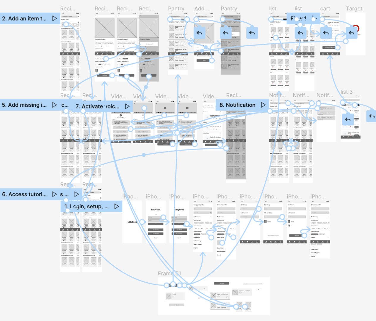
Picture: Low Fidelity
User Testing Responses
From our user testing with 8 participants, we received several feedbacks, which were condensed based on common trends and by filtering out those that didn’t align with the project goal.
| Key feedbacks that were integrated into the mid-fidelity prototype | |
|---|---|
| 1 | Split up on boarding screens to reduce cognitive load. |
| 2 | Modify the ingredients list to identify from controlled vocabulary |
| 3 | Increase font sizes for better readability. |
| 4 | Change the units of used pantry from lbs/oz. to slices/bowls/tablespoons (user language) |
| 5 | Add speaking instructions before tapping to avoid ambiguity. |
| 6 | Add descriptions to improve understanding of functionalities (missing pantry, add ingredients to filter recipes) |
| 7 | Add highlights on the icon representing current tab to improve navigation. |
| 8 | Add more icons on recipe and shopping page for better understanding. |
| 9 | Highlight current instruction on tutorial page to improve focus. |
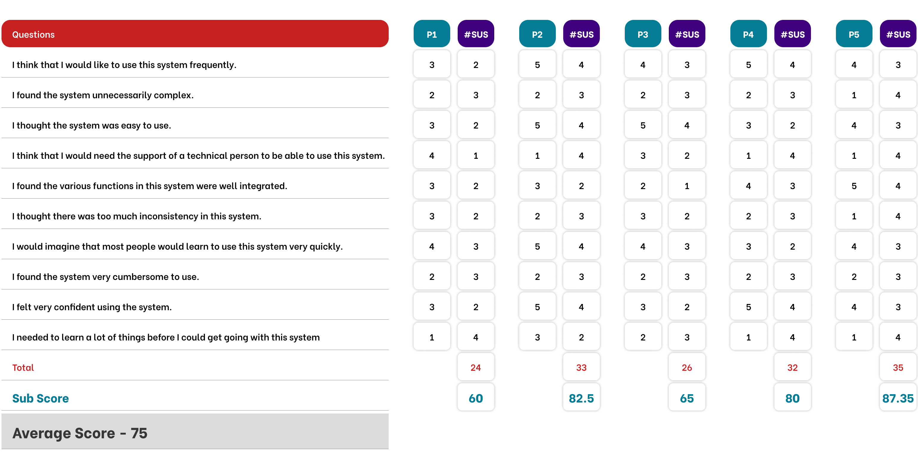
Picture: System Usability Scale (SUS)